Goals of the Redesign
- Enhance usability: Streamline navigation for an intuitive user experience.
- Improve visual appeal: Modernize the interface to align with current design trends.
- Increase functionality: Add features to provide users with better game-finding options (e.g., Map View).
Key Redesigns
- Home Page
- Problem Identified: Overcrowded UI made it difficult for users to focus on key actions like finding or joining games.
- Solution: Simplified the layout by emphasizing primary calls-to-action, such as "Find a Game" and "Create a Game." Integrated dynamic content cards for easy access to upcoming matches and personalized recommendations.
- Tab View
- Problem Identified: Navigation tabs lacked differentiation, making transitions between sections less intuitive.
- Solution: Redesigned the tab structure with a clean, minimalistic design. Added clear icons and labels for faster recognition and a more polished appearance.
- Roster Page
- Problem Identified: Limited visual hierarchy made it challenging to quickly view player availability and roles.
- Solution: Introduced a revamped layout with distinct sections for confirmed players, pending invites, and game stats. Added color-coded indicators for availability and streamlined player role assignments.
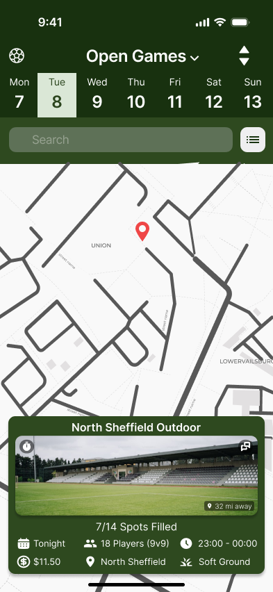
- Map View Page (New Feature)
- Objective: Help users locate games based on proximity and venue preferences.
- Implementation: Created an interactive map displaying game locations with filter options for date, time, and skill level. Integrated live distance estimates for better decision-making.
Design Tools and Process
- Tools Used: Figma for wireframing and prototyping, Adobe Illustrator for icons, and user feedback sessions to iterate designs.
- Process:
- Conducted usability audits of the existing app.
- Created wireframes for the redesign.
- Developed high-fidelity mockups and interactive prototypes.
- Validated designs through usability testing with existing Plei users.
Outcomes and Learnings
- The redesign significantly enhanced user workflows by reducing clutter and improving navigation.
- User testing revealed that the Map View was highly valued, with participants citing its practicality in finding nearby games.
- Iterative feedback ensured that the new design remained user-centric while maintaining the app’s core functionality.
Conclusion
This redesign was an exploratory exercise aimed at enhancing the Plei app’s user experience and visual appeal. It demonstrated how thoughtful design changes can improve functionality and user satisfaction. I’m excited to share these ideas with the Plei team and hope they inspire further refinements in the app's journey.
.png)
.jpg)